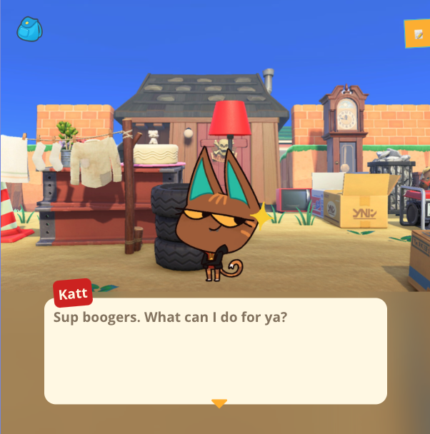
Developing A Game In React
What are the differences between developing a game and making a well organized web application? Surprisingly, there aren't as many as you would think!
Before starting development on AC: New Murder, I thought the move away from flash on the web meant the end of web games and shows like homestarrunner.
In listening to an interview Drew Conley gave on his game Danger Crew, my hope was sparked. Danger Crew and New Murder both are built on modern web development technology. At the end of the day, a game manages state, controls interactive elements, and renders specific views for different actions, just as a web application does.
Here I'll be pulling back the curtain on how those similarities came through in developing New Murder.
Rendering Dialogue
In this Sanity article we looked at the different data types required for all of the games assets and logics. A majority of that data is dialogue text. And much of the actual game logic in the app is handling what to do with that dialogue, especially when they move towards branching paths.
I was inspired by Twine, software I discovered way back when Ryan North of Dinosaur Comics fame wrote his first chose-your-own-adventure book. The software breaks down key moments in the narrative into individual nodes. The nodes can connect to each other by different response options and paths.
The client app for New Murder does the same. A dialogue scene runs through the phrases and animal illustrations. At the end, the user is either prompted for evidence, or is asked to answer a multiple-choice response prompt.
From there, the user is taken to the next dialogue scene based on their answer.
My favorite example of this is Julian's Testimony in the first trial. If I were to graph out the structure, it would look like this:
0 => 0 => 0 => 0 => Repeat or move on to next dialogue
|    |
V    V
0    0
|
V
0
By checking the dialogue properties, the game knows whether to render an objection option, and then once following down the next dialogue path, the game also handles when to offer presenting evidence or offering response options. When reaching the end of an "objection" path, the user is then sent back to the main testimony path, one step further than they were before.
State Management
This is where I was surprised to see that I felt most at home developing that app from my experience with web development. There were certainly more pieces of state to manage with a game that stored the player's inventory, previously visited conversations, what conversation they were in, what paths they were on, and the list goes on. Managing that state, however, and the best practices for organizing it, very closely followed what goes into a web application!
UI state, API data, and player save data were stored through separate reducers within the store. The store's structure at a top level was structured like so:
store/
├── app/
├── dialogue/
│   ├── currentDialoguePosition
│   ├── currentdialogueName
│   ├── phrases
│   └── . . .
├── conversations/
├── inventory/
├── health/
├── sprites/
├── notepad/
├── loaded/
├── inquiry/
├── act3Scenes/
└── specialEvents/
State updated in three instances:
- On App load, user's save data was loaded in from local storage, where the game continually simultaneously saves when the user makes progress
- On page load, the specific conversation or menu screen requests for the relevant data from the API
- On interaction, UI changes are made, including progressing through the dialogue, adding to the player's inventory, or receiving an achievement
All familiar tasks when designing any other web application, such as a user account portal. Even marking their game progress and saving their game data is not too dissimilar from managing form data, just without the inputs and validation.
A particularly interesting piece of state are Agent S's notes. These are tasks within the game with particular ways of completing them. An Agent S Note (SNote, for short) is stored into redux like so:
{
    count: 4,
    description: "Get Lucky to remember yesterday by presenting evidence to him.",
    name: "luckyMemories",
}
There are two types of SNotes:
- One-offs, requiring only one action to check them off
- Counters, requiring multiple actions to check them off.
In the game, Jenn is able to add points where player's achieve a SNote by adding the SNote's name to the dialogue field. The app knows that when it comes across "luckyMemories" while going through dialogue, to check off the task. If it's a one-off, it's done! If it's a counter, it increments the number of times it's seen "luckyMemories" until reaching 4, then it's complete!
Achieving SNotes eventually leads to unlocking the final part of the game, where the player needs the most evidence and deepest understanding of the events that transpired. These were a fun way to add direction and celebrate progress through the game!
Saving Player Info
As mentioned earlier, I opted to use local storage to maintain player save data.
I considered the option of spinning up a server, allowing users to create an account, and log in from any device to continue playing the game. For this project's particular requirements, needing a very thorough front end application and a thoughtful crafting of the CMS for Jenn, I was looking to see where I could save time and energy for those two major focuses.
Most players will likely only play the game on a single device. And save data is not highly sensitive or personal. That considered, using local storage was a reasonable compromise for the project.
Animations
The app really came to life when I started adding in animations! I wanted to give as much of a native game feeling to our app as I could. The animations are mostly small transitional touches that add a bit of life and playfulness to the game. The techniques I used were:
- Text Animation with Typist
- CSS Transition Animations
- Keyframe animations
- Framer Motion Animation Library
Pure CSS Animations
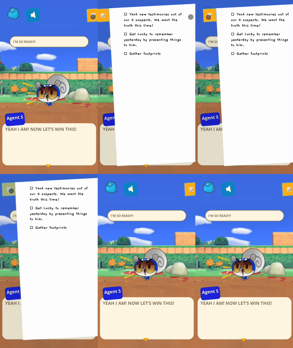
Built in CSS animations cover the small touches, such as menus swiping in and icons shaking or bouncing. Below is one of my favorites: Agent S's Notepad.
One of the 12 Principles of Animation is Anticipation, a gesture preparing the viewer for an action. The pulling back before springing forward motion here is just that, and was accomplished with this simple line of css:
.notepad_wrapper {
    transition: transform 0.8s cubic-bezier(0.47, -0.51, 0.46, 1.64);
}
Here's another example: keyframes for a bouncing caret icon or the error message shake.
@keyframes bounce {
  from {
    transform: translate3d(0, 0, 0);
  }
  to {
    transform: translate3d(0, 10px, 0);
  }
}
JavaScript Animation
Since it's a heavy resource, I wanted to keep animating with JavaScript to a minimum. It's worth noting that this is different from JS merely firing off animations that are then handled by CSS. That we'll explore how JavaScript is firing off css animations in the section below.
The one case where JavaScript was the best tool for animation was with the dialogue text. Character speech was a major part of the game and would be a big contributor to making the app feel like a true native game.
I initially scripted out a vanilla JS type-writer function that would lay out pieces of dialogue character by character. Eventually we went with another package for this functionality to more easily handle non-text portions of the dialogue, such as icon images and text highlighting.
CSS Transition Group
Animal illustrations were loaded in dynamically, making them a perfect use case for React Transition Group. Animals slide in and out, sometimes taking center stage, or being pushed off to the side when another animal hops in
There are different classes dynamically set for the animals based on their positioning when they enter. Different animations handle the transition from off stage to center, center to left, and left to right.
Framer Motion
The true native feel came from bringing in page transitions with Framer Motion. Each page has a loading screen overlay that swipes in and out between the stages, almost like a curtain for scene transitions.
Here's how it works: Framer Motion has built in functionality for working with React Router. What needs to happen is a handshake for a really smooth transition. After a link is clicked (or an action leads to switching pages), Framer Motion intercepts the request to React Router. It delays the new page from loading until the exiting animation has occurred.
Then, the next page loads. The next page also has an on load animation, mirroring the exiting animation of the previous page. So on the first page, the loading overlay swiped in. On the next page's load, a copy of the overlay is displayed and swipes out.
Mobile and Desktop View
With much of my time and energy focused on handling game logic and creating the CMS, the flexibility of the game's UI is another area where I had to eventually make a compromise time-wise.
Our initial ambition was to create an application that looked elegant on all devices. Phones, tablets, and desktop. When working with primarily text and an endless scrolling page, there's a lot of room for flexibility and responsive design. When it came to developing a game with specifically sized assets and menus, it became more complex.
Ultimately, I was able to create two views: Desktop and Mobile, with tablets rendering the desktop version.
Desktop has a fixed window for viewing the game:
Mobile is a full screen rendering of the game:
The Mobile version was optimized for most popular dimensions, iPhones being my basis. Things got strange with tablet dimensions, however, and it became difficult to handle a very particularly staged set of character positions, menus, and fixed background size in this size range.
That's what lead to showing the desktop version on tablet devices. We had hoped for an experience similar to mobile, but given the constraints of a position sensitive layout with less flexibility, it's another one I saw as worth taking.
Wrapping Up
There's much to be proud of with this application, but I'm happiest with how the front end turned out! Working through game logic was an interesting puzzle. Managing the application's state and performance was delightfully surprising! The process drew from my experience working in web development seamlessly. And the small touches of animation help make the story come alive. Even deciding on trade offs boosted my confidence in my ability to work with the resources I had to create a fun piece of software.
I hope you check out AC: New Murder!
If you're interested in reading more about the nitty gritty of developing the tech or how I managed the project, you can read my deep dive on each below:
You can also follow Jenn's art and work from her site or twitter.


